from cdi_viz.theme import cdi_notebook_init, show_and_save_mpl

cdi_notebook_init(chapter="04")Seaborn Comparisons
Matplotlib gives control. Seaborn gives speed for common analytical plots:
- distributions
- group comparisons
- relationship summaries
We keep styling minimal and focus on the statistical view.
Load data
import pandas as pd

df = pd.read_csv("data/cdi-student-outcomes.csv")
print(df.head())
group test_prep study_hours math_score reading_score writing_score
0 Group B completed 3.9 58 64 51
1 Group A none 7.7 67 85 61
2 Group A none 9.3 83 65 73
3 Group A none 3.9 60 67 48
4 Group A none 8.3 68 63 47Distribution: density view
import matplotlib.pyplot as plt
import seaborn as sns

fig, ax = plt.subplots()

sns.kdeplot(data=df, x="math_score", fill=True, ax=ax)

ax.set_xlabel("Math score")
ax.set_ylabel("Density")

ax.set_title(
    "Density view supports comparison",
    pad=10,
    loc="center"
)

fig.suptitle(
    "Distribution of Math Scores",
    y=1.02,
    fontweight="bold",
    ha="center"
)

ax.grid(True, axis="y", linewidth=0.4, alpha=0.3)
ax.grid(False, axis="x")

show_and_save_mpl(fig)
Saved PNG → figures/04_001.png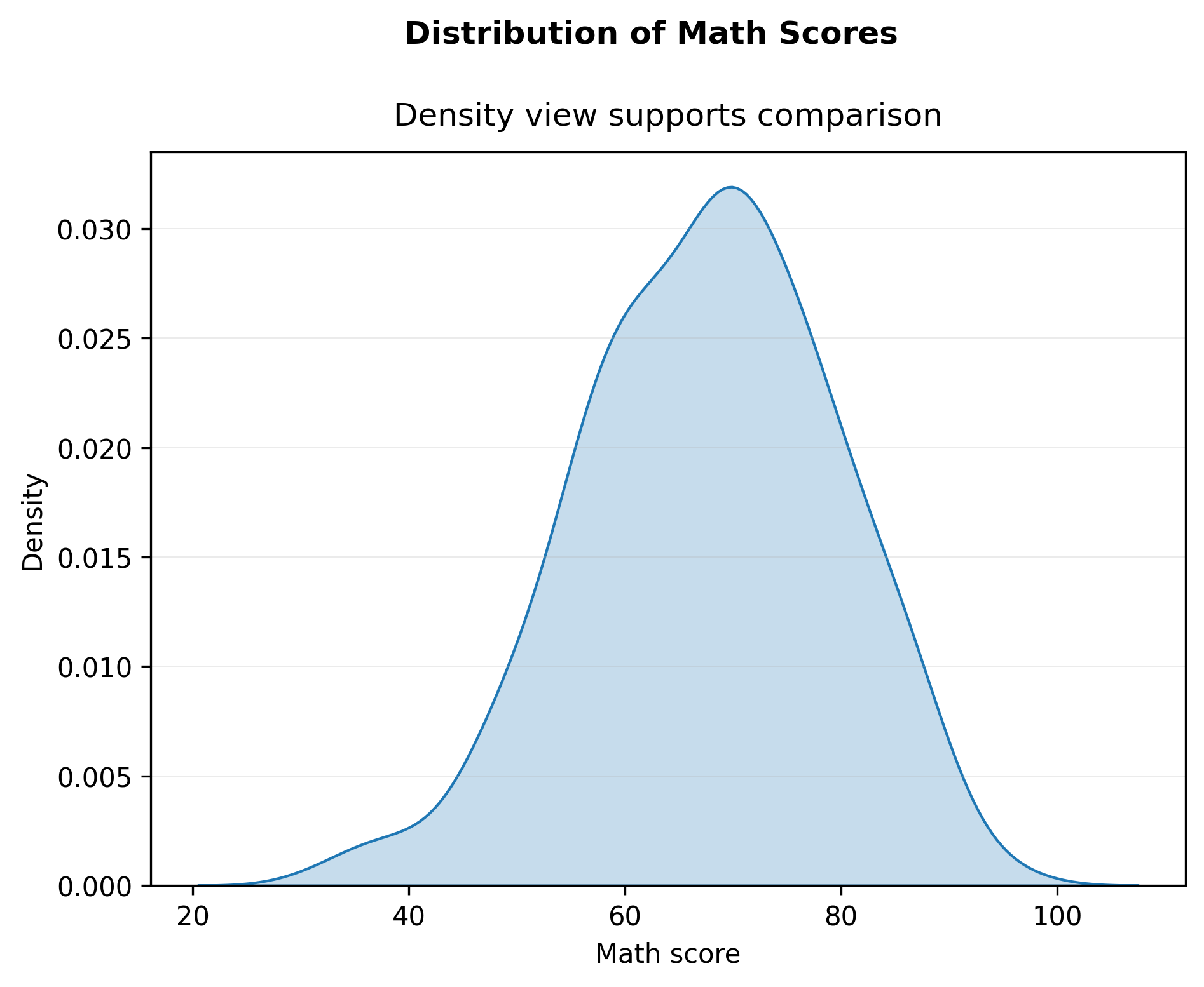
Group comparison: boxplot
import matplotlib.pyplot as plt
import seaborn as sns

fig, ax = plt.subplots()

sns.boxplot(data=df, x="test_prep", y="math_score", ax=ax)

ax.set_xlabel("Test preparation")
ax.set_ylabel("Math score")

fig.suptitle("Math Score by Test Preparation", fontweight="bold", y=1.02)
ax.set_title("Boxplots summarize differences across groups", pad=10)

ax.grid(True, axis="y", linewidth=0.4, alpha=0.3)
ax.grid(False, axis="x")

fig.tight_layout()

show_and_save_mpl(fig)
Saved PNG → figures/04_002.png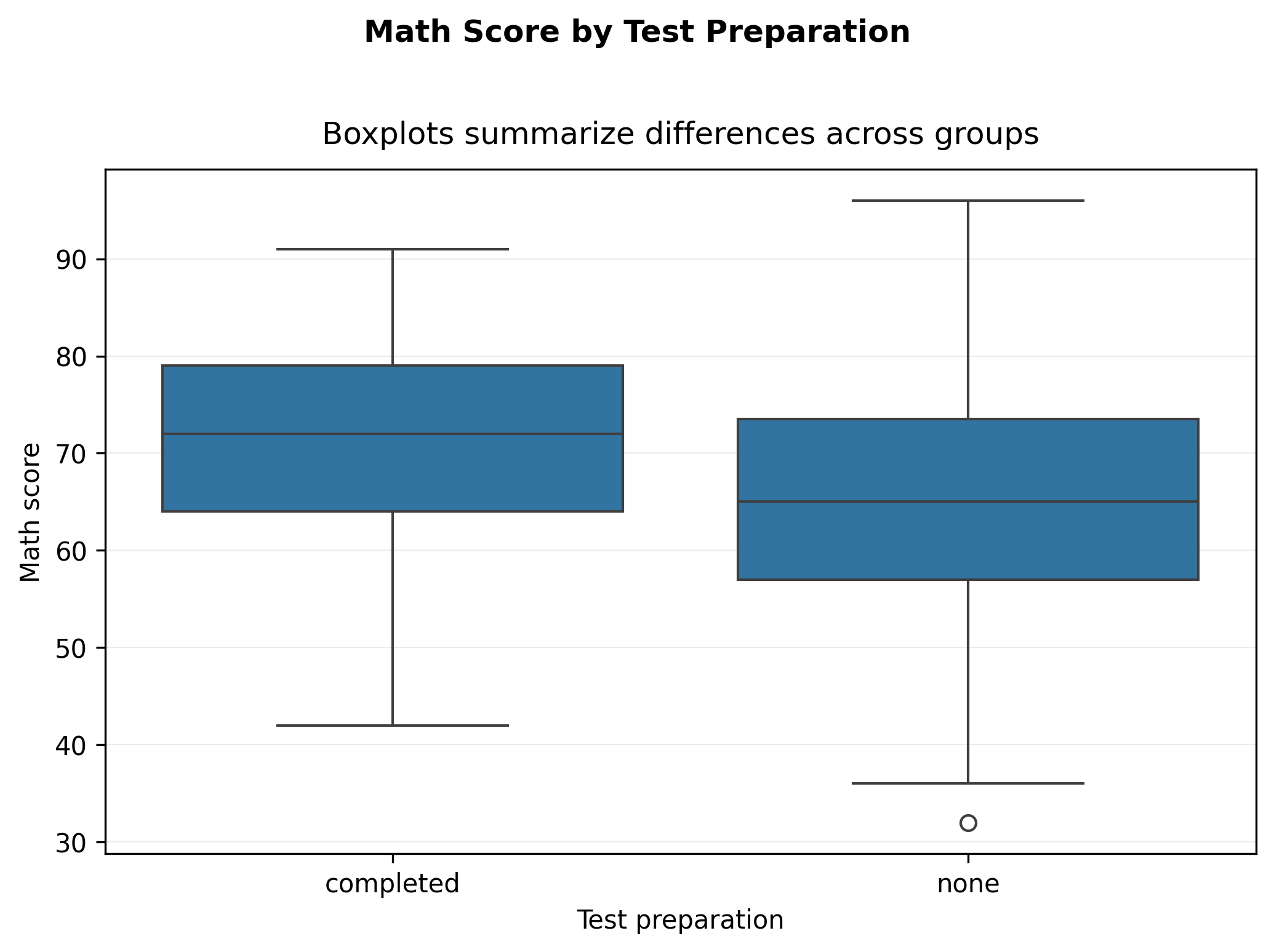
Add points (summary + raw data)
import matplotlib.pyplot as plt
import seaborn as sns

fig, ax = plt.subplots()

sns.boxplot(data=df, x="test_prep", y="math_score", ax=ax)
sns.stripplot(data=df, x="test_prep", y="math_score", ax=ax, alpha=0.35, jitter=0.25)

ax.set_xlabel("Test preparation")
ax.set_ylabel("Math score")

fig.suptitle("Math Score by Test Preparation", fontweight="bold", y=1.02)
ax.set_title("Summary plus raw points for honesty", pad=10)

ax.grid(True, axis="y", linewidth=0.4, alpha=0.3)
ax.grid(False, axis="x")

fig.tight_layout()

show_and_save_mpl(fig)
Saved PNG → figures/04_003.png
Relationship: trend summary
import matplotlib.pyplot as plt
import seaborn as sns

fig, ax = plt.subplots()

sns.regplot(
    data=df,
    x="study_hours",
    y="math_score",
    scatter_kws={"alpha": 0.55},
    ax=ax
)

ax.set_xlabel("Study hours per week")
ax.set_ylabel("Math score")

fig.suptitle("Study Hours vs Math Score", fontweight="bold", y=1.02)
ax.set_title("Trend summary with fitted line", pad=10)

ax.grid(True, axis="y", linewidth=0.4, alpha=0.3)
ax.grid(False, axis="x")

fig.tight_layout()

show_and_save_mpl(fig)
Saved PNG → figures/04_004.png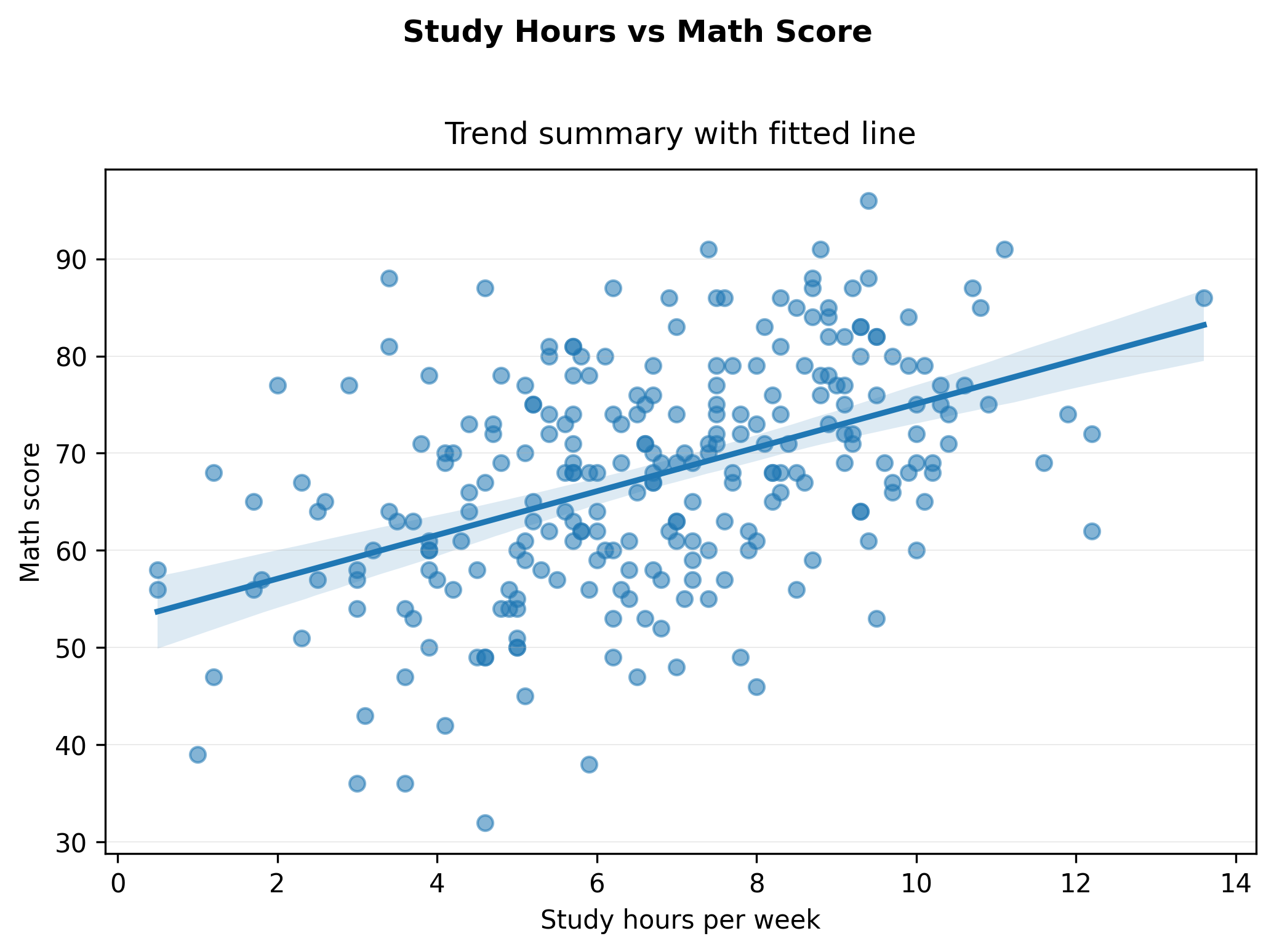
Key Takeaways
- Seaborn accelerates common analytical plots.
- Use summaries (boxplots, trend lines) to support comparison.
- Keep raw data visible when possible.
- Interpretation still matters more than styling.