Interactive Plotly Basics

  • ID: VISPY-006
  • Type: Lesson
  • Audience: Public
  • Theme: Interactivity with purpose

This chapter introduces interactive visualizations using Plotly.

Plotly charts are naturally interactive. In a live Python environment you can hover, zoom, pan, toggle legend groups, and download high-resolution images from the toolbar.

In this CDI free track, charts are rendered as static PNG snapshots for consistency and clean book builds. The PNGs are automatically generated from the same Plotly code using the shared CDI export helper.

To experience full interactivity (hover, zoom, legend toggling), run this chapter locally in Jupyter Notebook, JupyterLab, or VS Code. The first example below is intended to be viewed interactively during development (show=True).


Requirements

Plotly static PNG export requires kaleido.

pip install -U kaleido

Setup

import warnings
import pandas as pd
import plotly.express as px

from cdi_viz.theme import (
    cdi_notebook_init,
    cdi_theme,
    show_and_save_plotly,
)

warnings.filterwarnings("ignore")

# Chapter init: sets Plotly theme + resets the shared figure counter
cdi_notebook_init(chapter="06", title_x=0.5)

df = pd.read_csv("data/cdi-student-outcomes.csv")
print(df.head())
     group  test_prep  study_hours  math_score  reading_score  writing_score
0  Group B  completed          3.9          58             64             51
1  Group A       none          7.7          67             85             61
2  Group A       none          9.3          83             65             73
3  Group A       none          3.9          60             67             48
4  Group A       none          8.3          68             63             47

Understand the dataset

This guide uses a CDI synthetic dataset designed for clear plotting practice.

File: data/cdi-student-outcomes.csv

Columns available:

list(df.columns)
['group',
 'test_prep',
 'study_hours',
 'math_score',
 'reading_score',
 'writing_score']

Quick mental model:

  • study_hours and math_score support relationship plots
  • test_prep and group support comparisons and faceting
  • reading_score and writing_score provide extra hover context

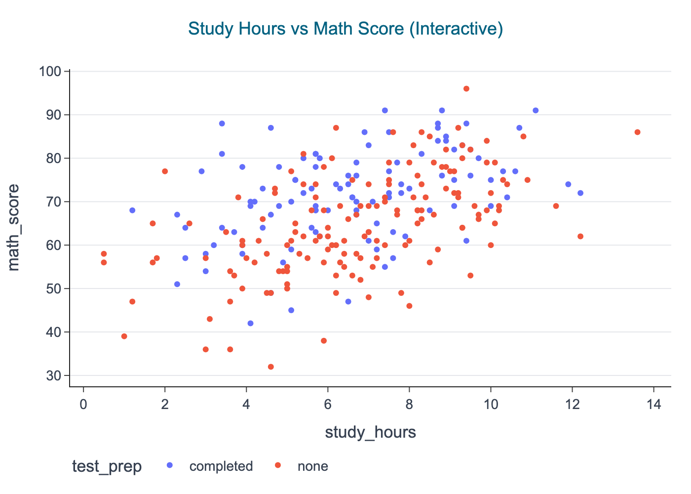
First interactive Plotly visualization

Interactive scatter plot

This plot answers:

Does study time relate to math performance, and does test preparation matter?

fig = px.scatter(
    df,
    x="study_hours",
    y="math_score",
    color="test_prep",
    hover_data=["group", "reading_score", "writing_score"],
    title="Study Hours vs Math Score (Interactive)",
)

cdi_theme(fig, title_x=0.5) # center the title

# Development mode: interactive view + exported PNG
show_and_save_plotly(fig, show=False)  # figures/06_001.png
Saved PNG → figures/06_001.png

When you run locally, hover points to inspect values. In the book, you will see the PNG snapshot saved in figures/.
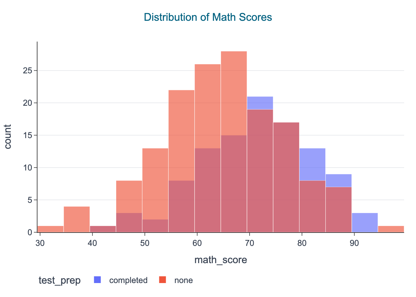

Distribution views

Histogram: distribution of math scores

fig = px.histogram(
    df,
    x="math_score",
    color="test_prep",
    barmode="overlay",
    opacity=0.65,
    nbins=30,
    title="Distribution of Math Scores",
)

cdi_theme(fig, title_x=0.5)

# Book rendering: save PNG only (no interactive output)
show_and_save_plotly(fig, show=False)  # figures/06_002.png
Saved PNG → figures/06_002.png

Interpretation prompts:

  • Are the distributions shifted?
  • Is one group more variable?
  • Do you see ceiling or floor effects?

Group comparisons

Box plot: math score by test preparation

fig = px.box(
    df,
    x="test_prep",
    y="math_score",
    title="Math Score by Test Preparation",
    labels={"test_prep": "Test preparation", "math_score": "Math score"},
)

fig.update_traces(
    boxpoints="all",
    jitter=0.25,
    pointpos=0,
    marker=dict(size=4, opacity=0.6),
)

cdi_theme(fig, title_x=0.5)
show_and_save_plotly(fig, show=False)
Saved PNG → figures/06_003.png

Why this is useful:

  • the box summarizes distribution (median + spread)
  • points keep the plot honest

Small multiples (faceting)

Faceting is one of the cleanest ways to compare patterns without mixing categories into one panel.

Scatter plot faceted by group

fig = px.scatter(
    df,
    x="study_hours",
    y="math_score",
    color="test_prep",
    facet_col="group",
    title="Study Hours vs Math Score (Faceted by Group)",
)

cdi_theme(fig, title_x=0.5)

show_and_save_plotly(fig, show=False)  # figures/06_004.png
Saved PNG → figures/06_004.png

Interpretation prompts:

  • Does the relationship look similar in each group?
  • Is one group consistently higher?
  • Are outliers concentrated in one panel?

Summary

In this chapter you used Plotly to build interactive views and exported them as stable PNGs:

  • interactive scatter plots
  • distributions (histograms)
  • comparisons (box plots + points)
  • faceted small multiples

Use Plotly interactivity during exploration, then publish stable PNG figures for reports and book builds.


Exercises

  1. Build an interactive scatter plot using reading_score vs writing_score.
  2. Create a histogram of study_hours and compare by test_prep.
  3. Make a box plot for reading_score by group (points on).
  4. Facet a scatter plot by group and color by test_prep.
  5. For one figure, set show=True to explore it interactively, then switch back to show=False for publishing.