Theme: Reproducible figure export and publication discipline
Professional visualization is not only about creating figures. It is about exporting them consistently and reproducibly.
In this lesson you will:
understand static vs interactive outputs
export high-resolution PNG figures
control figure dimensions
maintain clean project structure
avoid duplicate or unstable outputs in Quarto builds
All figures are exported to figures/ using CDI helpers.
Setup
import warningsimport pandas as pdimport matplotlib.pyplot as pltimport seaborn as snsimport plotly.express as pxfrom cdi_viz.theme import ( cdi_notebook_init, cdi_theme, show_and_save_mpl, show_and_save_plotly,)warnings.filterwarnings("ignore")cdi_notebook_init(chapter="09")df = pd.read_csv("data/cdi-student-outcomes.csv")print("First rows:")print(df.head())
First rows:
     group  test_prep  study_hours  math_score  reading_score  writing_score
0  Group B  completed          3.9          58             64             51
1  Group A       none          7.7          67             85             61
2  Group A       none          9.3          83             65             73
3  Group A       none          3.9          60             67             48
4  Group A       none          8.3          68             63             47
Static Export: Matplotlib (High Resolution)
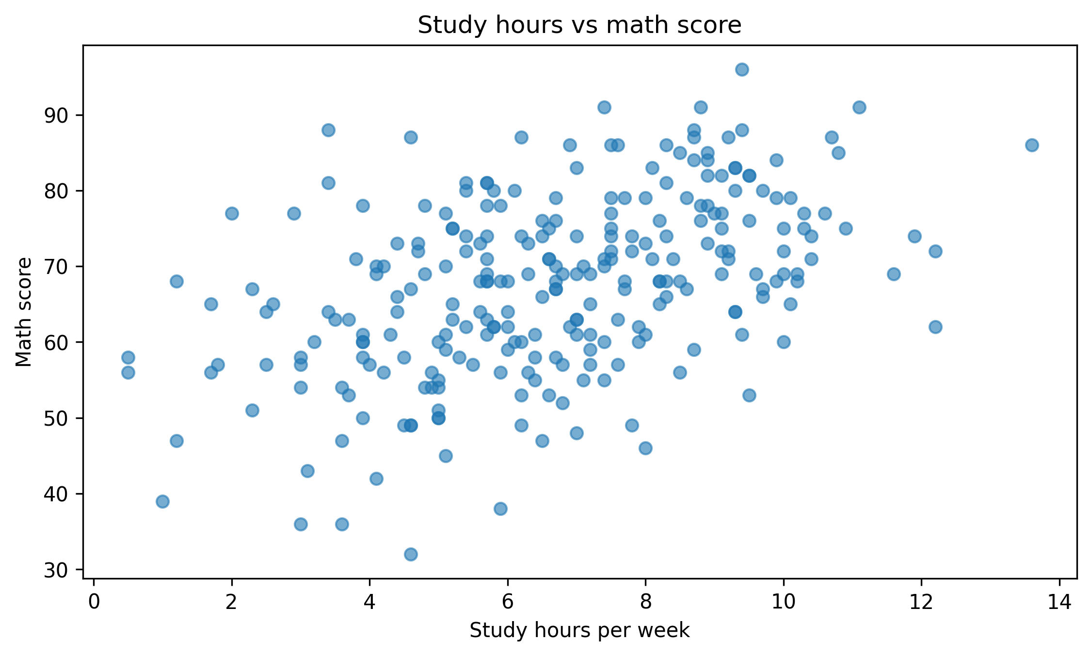
fig, ax = plt.subplots(figsize=(7.6, 4.6))ax.scatter(df["study_hours"], df["math_score"], alpha=0.6)ax.set_title("Study hours vs math score")ax.set_xlabel("Study hours per week")ax.set_ylabel("Math score")fig.tight_layout()show_and_save_mpl(fig, dpi=300) # figures/09_001.png
Saved PNG → figures/09_001.png
Controlling Figure Size
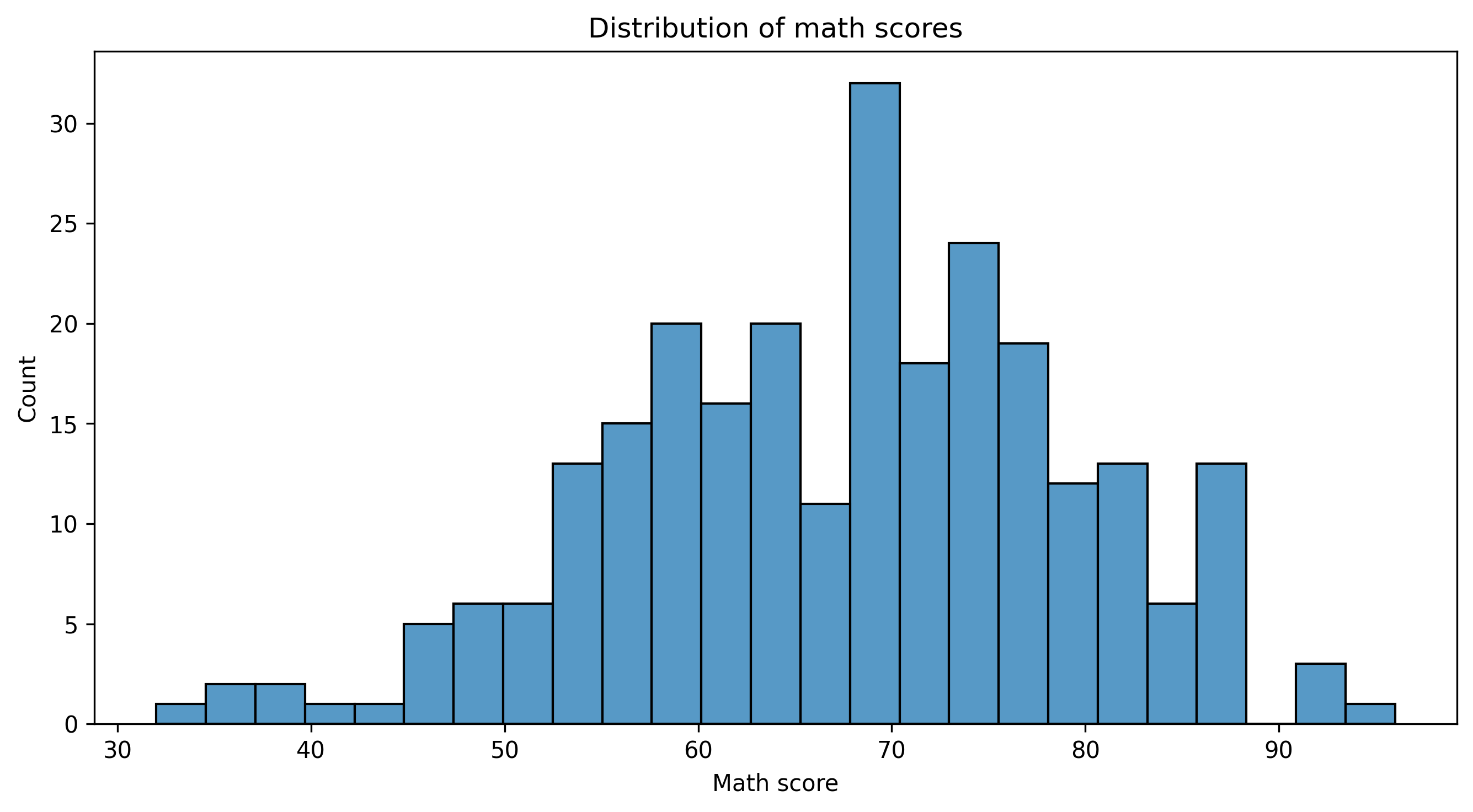
fig, ax = plt.subplots(figsize=(9, 5))sns.histplot(df["math_score"], bins=25, ax=ax)ax.set_title("Distribution of math scores")ax.set_xlabel("Math score")ax.set_ylabel("Count")fig.tight_layout()show_and_save_mpl(fig, dpi=300) # figures/09_002.png
Saved PNG → figures/09_002.png
Plotly: Static Snapshot Export
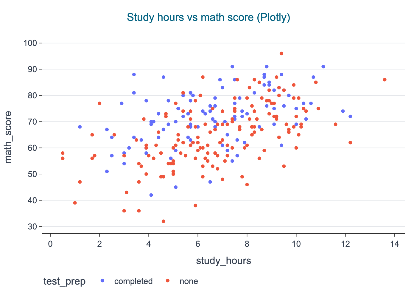
fig = px.scatter( df, x="study_hours", y="math_score", color="test_prep", title="Study hours vs math score (Plotly)",)cdi_theme(fig)show_and_save_plotly(fig, show=False) # figures/09_003.png
Saved PNG → figures/09_003.png
Project Structure Discipline
A clean visualization project should look like this: