Mini Capstone: Building a Structured Visual Report
ID: VISPY-FREE-12
Type: Capstone
Audience: Public
Theme: From plots to structured visual reasoning
This mini capstone brings everything together.
You will build a short, structured visual report using:
disciplined chart selection
multi-panel comparison
annotations
color consistency
export control
The goal is not to produce many plots.
The goal is to produce a small number of clear, defensible figures.
Setup
import warningsimport pandas as pdimport matplotlib.pyplot as pltimport seaborn as snsimport plotly.express as pxfrom cdi_viz.theme import ( cdi_notebook_init, set_cdi_theme, show_and_save_mpl, show_and_save_plotly,)warnings.filterwarnings("ignore")cdi_notebook_init(chapter="12")df = pd.read_csv("data/cdi-student-outcomes.csv")print("First rows:")print(df.head())
First rows:
     group  test_prep  study_hours  math_score  reading_score  writing_score
0  Group B  completed          3.9          58             64             51
1  Group A       none          7.7          67             85             61
2  Group A       none          9.3          83             65             73
3  Group A       none          3.9          60             67             48
4  Group A       none          8.3          68             63             47
Question 1
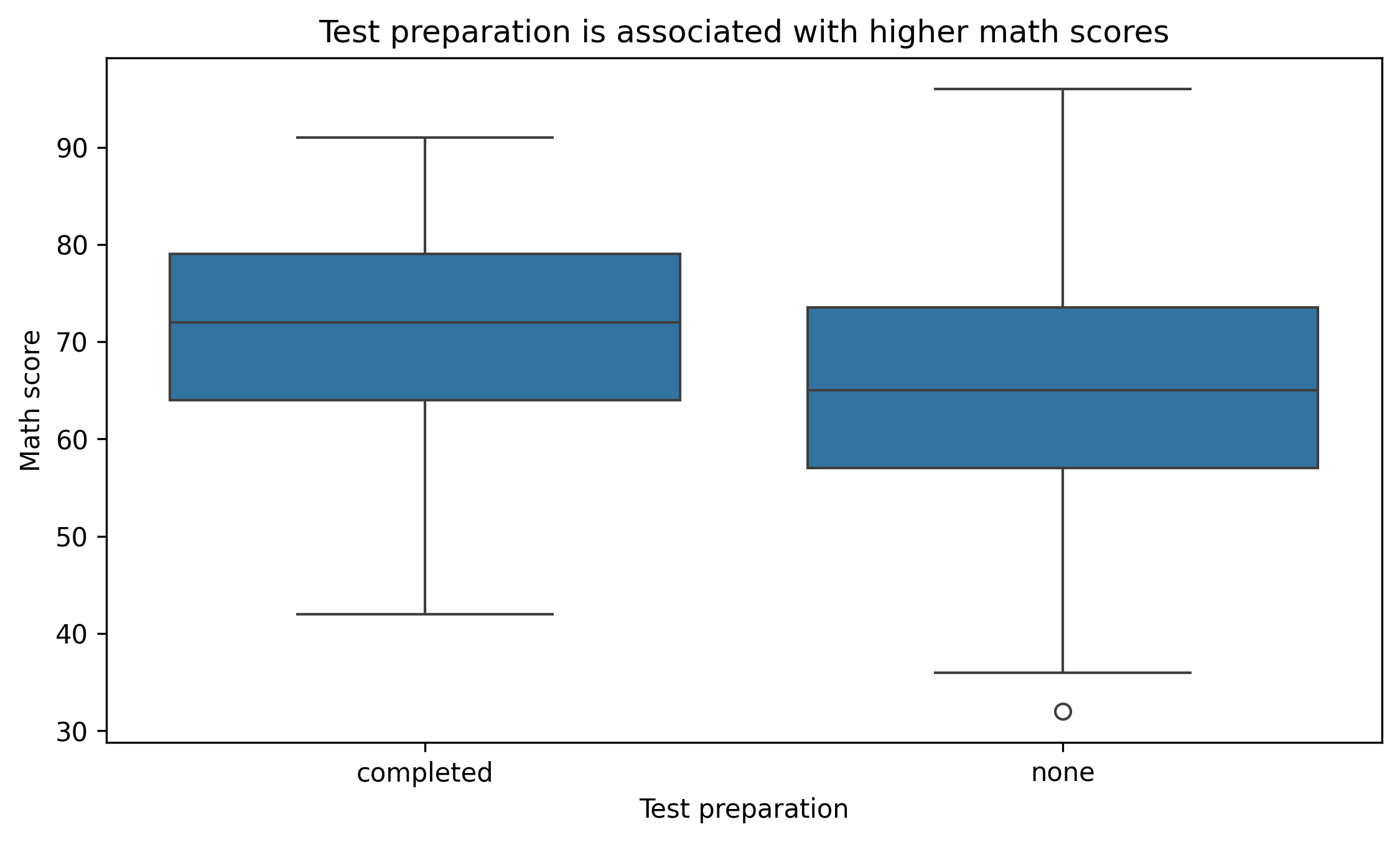
Is test preparation associated with higher math scores?
Figure 1: Distribution comparison
fig, ax = plt.subplots(figsize=(7.6, 4.6))sns.boxplot(data=df, x="test_prep", y="math_score", ax=ax)ax.set_title("Test preparation is associated with higher math scores")ax.set_xlabel("Test preparation")ax.set_ylabel("Math score")fig.tight_layout()show_and_save_mpl(fig) # figures/12_001.png
Saved PNG → figures/12_001.png
Interpretation:
Compare medians.
Compare spread.
Look for overlap.
Question 2
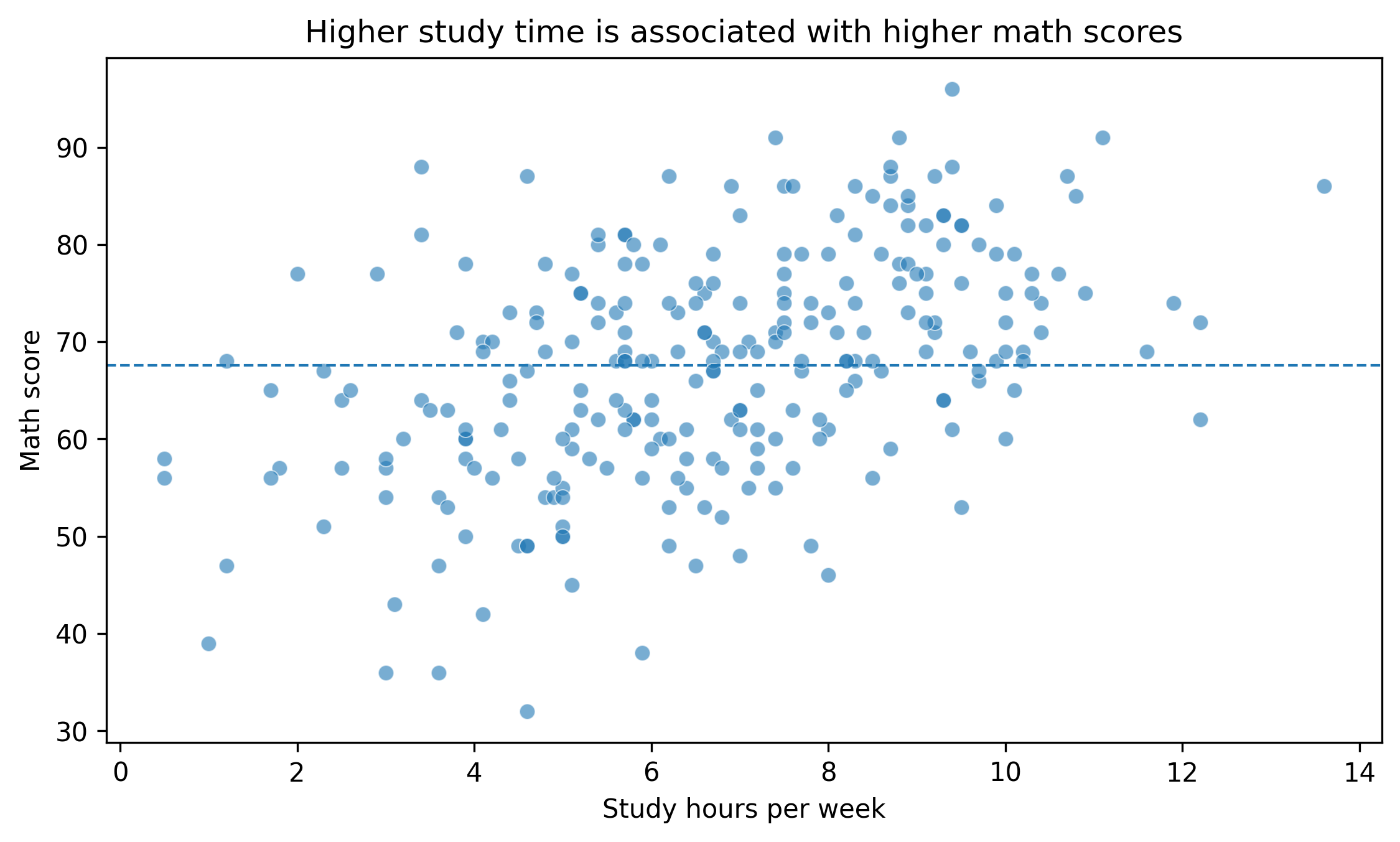
Does study time relate to performance?
Figure 2: Scatter with reference line
fig, ax = plt.subplots(figsize=(7.6, 4.6))sns.scatterplot(data=df, x="study_hours", y="math_score", alpha=0.6, ax=ax)mean_score = df["math_score"].mean()ax.axhline(mean_score, linestyle="--", linewidth=1)ax.set_title("Higher study time is associated with higher math scores")ax.set_xlabel("Study hours per week")ax.set_ylabel("Math score")fig.tight_layout()show_and_save_mpl(fig) # figures/12_002.png
Saved PNG → figures/12_002.png
Interpretation:
Is there visible trend structure?
Are there diminishing returns?
Are there extreme outliers?
Question 3
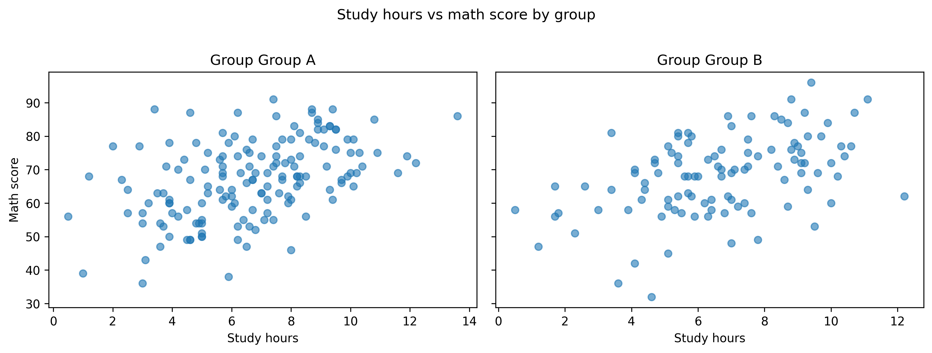
Do patterns differ by group?
Figure 3: Multi-panel comparison
groups =sorted(df["group"].unique())fig, axes = plt.subplots(ncols=len(groups), figsize=(11, 4), sharey=True)for ax, g inzip(axes, groups): sub = df[df["group"] == g] ax.scatter(sub["study_hours"], sub["math_score"], alpha=0.6) ax.set_title(f"Group {g}") ax.set_xlabel("Study hours")axes[0].set_ylabel("Math score")fig.suptitle("Study hours vs math score by group", y=1.02)fig.tight_layout()show_and_save_mpl(fig) # figures/12_003.png
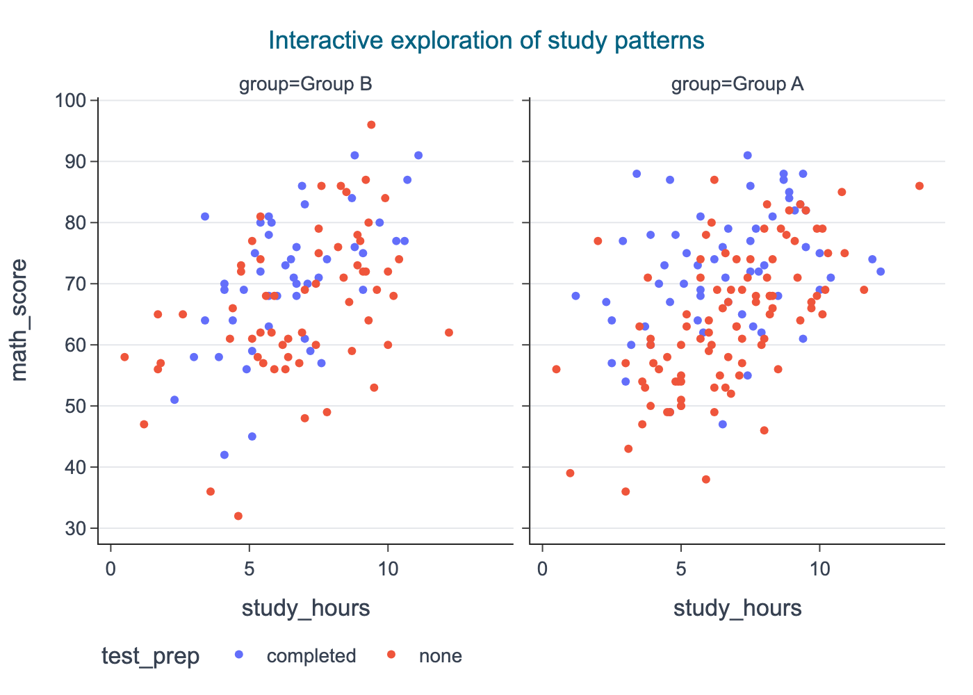
fig = px.scatter( df, x="study_hours", y="math_score", color="test_prep", facet_col="group", title="Interactive exploration of study patterns",)set_cdi_theme(fig)show_and_save_plotly(fig, show=False) # figures/12_004.png
Saved PNG → figures/12_004.png
Writing the Visual Summary
A structured visual report should:
State the question.
Show one focused figure.
Provide short interpretation.
Avoid overclaiming.
Example summary:
Test preparation is associated with higher median math scores, with moderate overlap between groups.
Study hours show a positive association with performance, though variability remains substantial.
Patterns appear broadly consistent across groups.
Capstone Checklist
Did you answer clear questions?
Did each figure support a claim?
Did you avoid unnecessary plots?
Are scales consistent?
Is interpretation cautious and evidence-based?
Key Takeaways
Professional visualization supports reasoning.
Fewer strong figures are better than many weak ones.
Structured reporting improves credibility.
Clarity is more important than complexity.
Final Exercise
Build your own three-question visual report using this dataset. Each question must: - use one primary figure - include a short interpretation - avoid unnecessary visual elements