import warningsimport pandas as pdimport matplotlib.pyplot as pltimport seaborn as snsfrom cdi_viz.theme import ( cdi_notebook_init, show_and_save_mpl,)warnings.filterwarnings("ignore")cdi_notebook_init(chapter="10")df = pd.read_csv("data/cdi-student-outcomes.csv")print("First rows:")print(df.head())
First rows:
     group  test_prep  study_hours  math_score  reading_score  writing_score
0  Group B  completed          3.9          58             64             51
1  Group A       none          7.7          67             85             61
2  Group A       none          9.3          83             65             73
3  Group A       none          3.9          60             67             48
4  Group A       none          8.3          68             63             47
1. Visual Hierarchy
A figure should guide the eye:
Title (main message)
Data
Axis labels
Annotations (if necessary)
If everything is bold, nothing stands out.
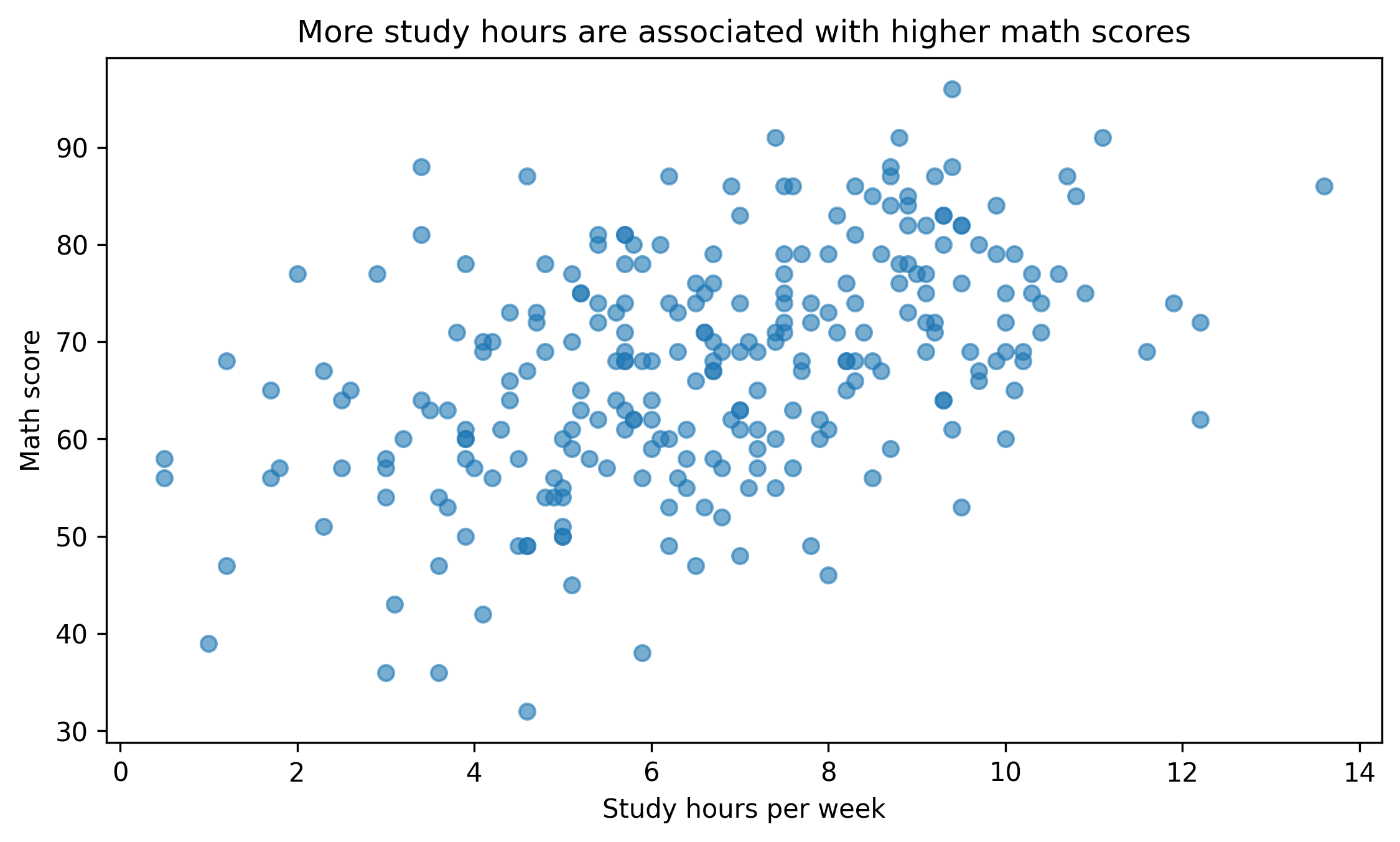
fig, ax = plt.subplots(figsize=(7.6, 4.6))ax.scatter(df["study_hours"], df["math_score"], alpha=0.6)ax.set_title("More study hours are associated with higher math scores")ax.set_xlabel("Study hours per week")ax.set_ylabel("Math score")fig.tight_layout()show_and_save_mpl(fig) # figures/10_001.png
Saved PNG → figures/10_001.png
Notice the title answers a question. It does not simply repeat variable names.
2. Color Discipline
Color should encode meaning, not decorate.
Bad practice: - Random colors - Too many categories - Saturated palettes without purpose
Good practice: - Neutral base - One highlight color - Consistent mapping across plots
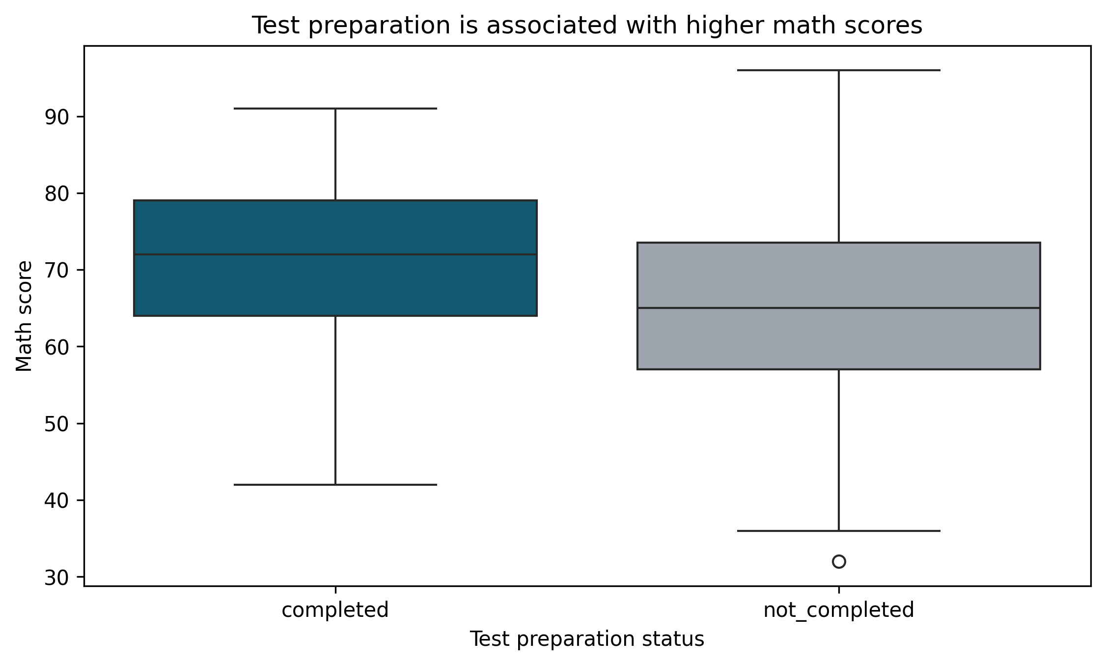
palette = {"completed": "#036281","not_completed": "#9CA3AF",}df["prep_label"] = df["test_prep"].map({"completed": "completed","none": "not_completed"})fig, ax = plt.subplots(figsize=(7.6, 4.6))sns.boxplot( data=df, x="prep_label", y="math_score", palette=palette, ax=ax)ax.set_title("Test preparation is associated with higher math scores")ax.set_xlabel("Test preparation status")ax.set_ylabel("Math score")fig.tight_layout()show_and_save_mpl(fig) # figures/10_002.png
Saved PNG → figures/10_002.png
Two colors. Clear meaning.
3. Reduce Visual Noise
Remove unnecessary elements:
Excess grid lines
Thick borders
Redundant legends
Background shading
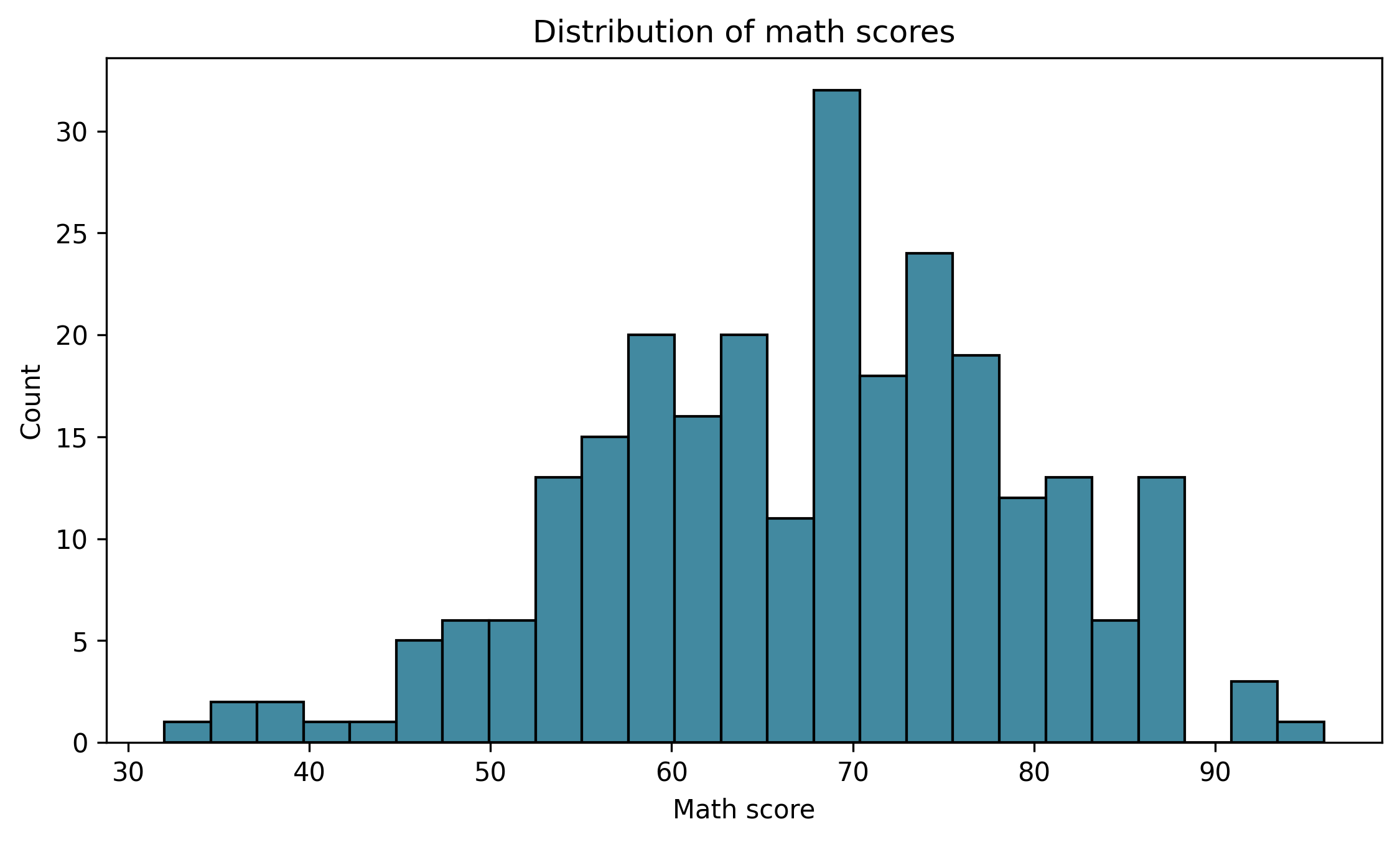
fig, ax = plt.subplots(figsize=(7.6, 4.6))sns.histplot(df["math_score"], bins=25, color="#036281", ax=ax)ax.set_title("Distribution of math scores")ax.set_xlabel("Math score")ax.set_ylabel("Count")ax.grid(False)fig.tight_layout()show_and_save_mpl(fig) # figures/10_003.png
Saved PNG → figures/10_003.png
Simple is stronger.
4. Consistent Mapping Across Figures
If blue means “completed”, it must always mean “completed”.
Never change color meaning across lessons or reports.
Consistency builds trust.
5. Common Design Mistakes
Avoid:
3D plots for 2D data
Excessive annotation
Rainbow colormaps for categorical data
Titles that restate axes
Legends inside data region
Design Checklist
Before exporting a figure:
Does the title communicate insight?
Is color used intentionally?
Is anything unnecessary?
Are categories consistently mapped?
Would this look appropriate in a professional report?
Key Takeaways
Hierarchy guides attention.
Color encodes meaning.
Simplicity increases clarity.
Consistency builds credibility.
Professional plots are restrained.
Exercises
Redesign a previous plot using only one highlight color.
Rewrite a neutral title into an insight-driven title.
Remove unnecessary grid lines and compare readability.
Create a two-color comparison plot with consistent mapping.