Theme: Multi-panel layouts for disciplined comparison
Single plots are useful, but many real questions require structured comparison:
the same plot repeated across groups
multiple metrics shown together
distributions plus relationships shown side by side
small multiples to avoid over-plotting and legend overload
In this lesson, you will build multi-panel figures using:
Matplotlib (subplots) for publication-style layouts
Seaborn (FacetGrid and catplot) for quick small multiples
Plotly facets for interactive comparison
All figures are exported to figures/ using the shared CDI counter.
Setup
import warningsimport pandas as pdimport matplotlib.pyplot as pltimport seaborn as snsfrom cdi_viz.theme import ( cdi_notebook_init, show_and_save_mpl, show_and_save_plotly, cdi_theme)warnings.filterwarnings("ignore")# Chapter init: resets the shared counter and ensures figures/ existscdi_notebook_init(chapter="07")df = pd.read_csv("data/cdi-student-outcomes.csv")print(df.head())
     group  test_prep  study_hours  math_score  reading_score  writing_score
0  Group B  completed          3.9          58             64             51
1  Group A       none          7.7          67             85             61
2  Group A       none          9.3          83             65             73
3  Group A       none          3.9          60             67             48
4  Group A       none          8.3          68             63             47
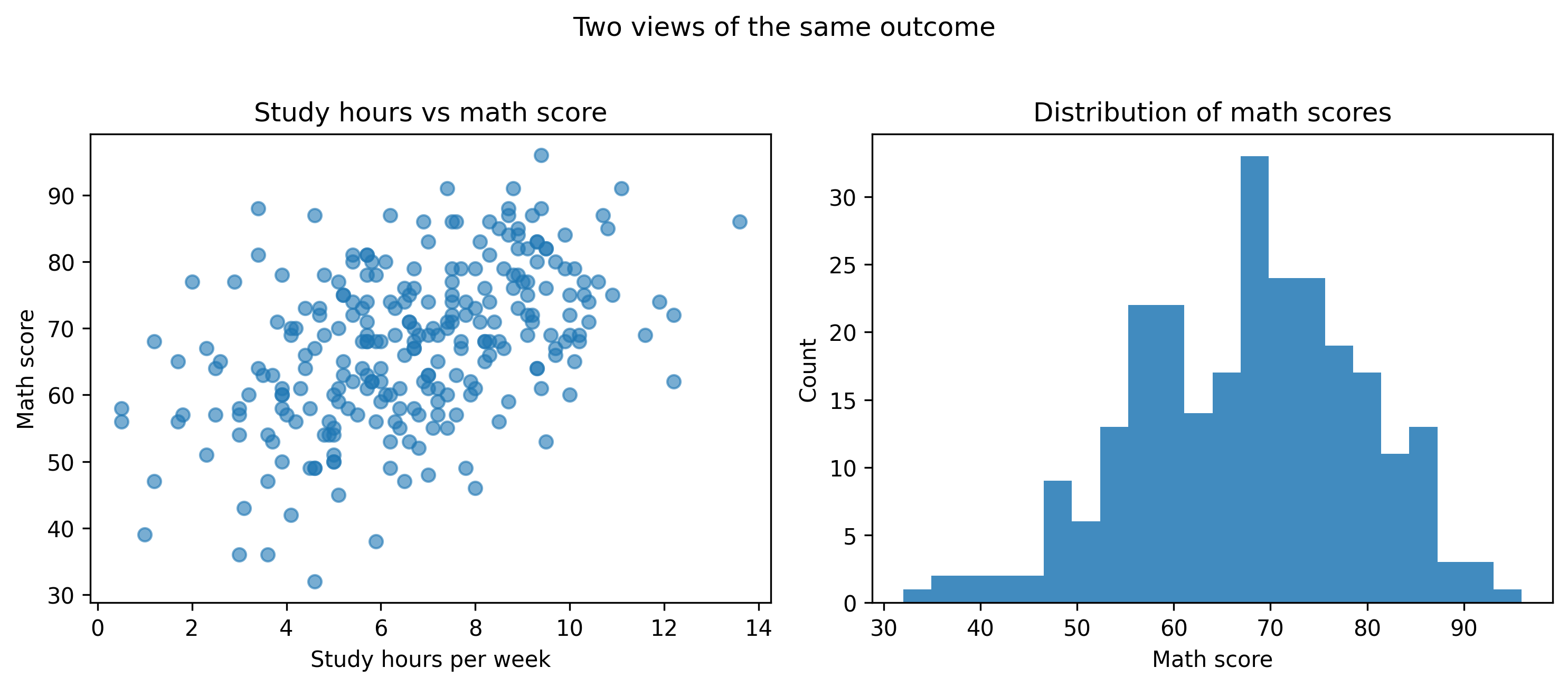
Matplotlib: a clean 2-panel comparison
This layout answers two questions at once:
Relationship: study time vs math score
Distribution: how math scores are spread
fig, axes = plt.subplots(ncols=2, figsize=(10, 4.2))# Panel 1: scatteraxes[0].scatter(df["study_hours"], df["math_score"], alpha=0.6)axes[0].set_title("Study hours vs math score")axes[0].set_xlabel("Study hours per week")axes[0].set_ylabel("Math score")# Panel 2: histogramaxes[1].hist(df["math_score"], bins=22, alpha=0.85)axes[1].set_title("Distribution of math scores")axes[1].set_xlabel("Math score")axes[1].set_ylabel("Count")fig.suptitle("Two views of the same outcome", y=1.02)fig.tight_layout()show_and_save_mpl(fig) # figures/07_001.png
Saved PNG → figures/07_001.png
Why this works
The left panel shows structure (trend and outliers).
The right panel shows distribution (spread and skew).
Together they prevent over-interpreting a single view.
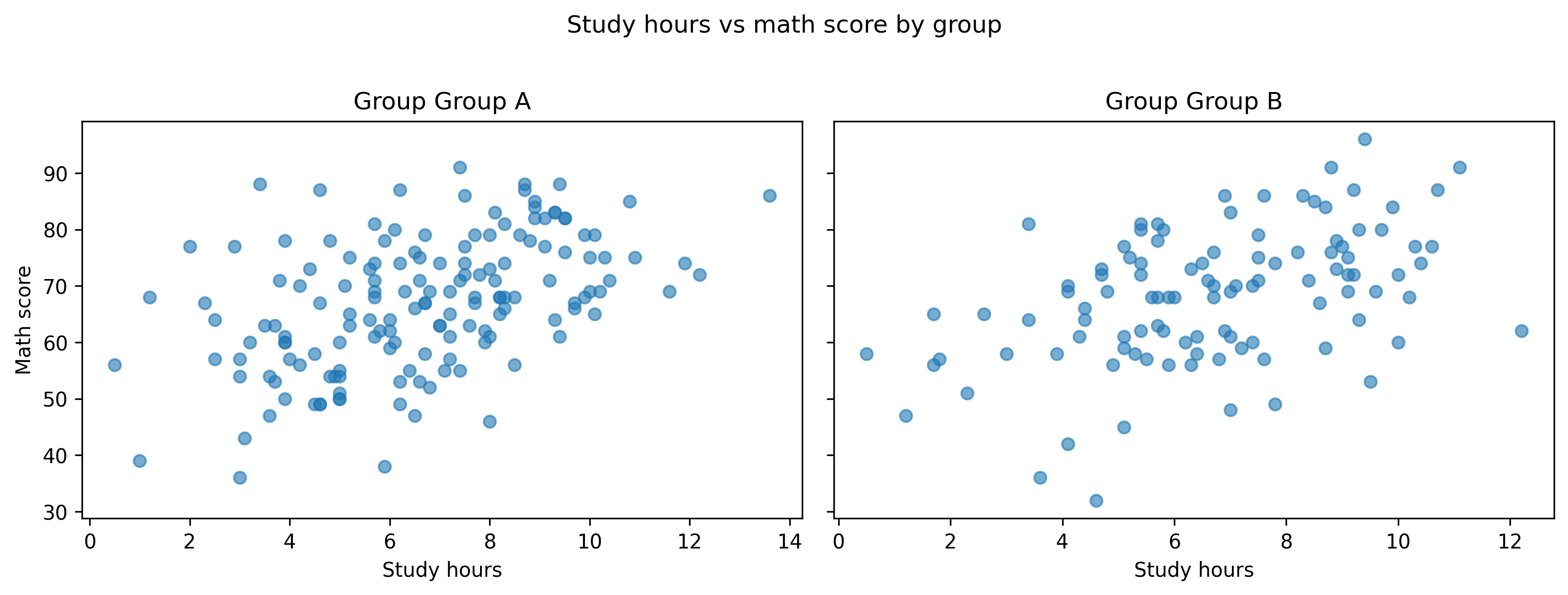
Matplotlib: small multiples with shared scales
Small multiples are disciplined comparison: same axes, same scales, repeated across groups.
Here we repeat the same scatter plot for each group.
groups =sorted(df["group"].unique())fig, axes = plt.subplots(ncols=len(groups), figsize=(11, 4), sharey=True)for ax, g inzip(axes, groups): sub = df[df["group"] == g] ax.scatter(sub["study_hours"], sub["math_score"], alpha=0.6) ax.set_title(f"Group {g}") ax.set_xlabel("Study hours")axes[0].set_ylabel("Math score")fig.suptitle("Study hours vs math score by group", y=1.02)fig.tight_layout()show_and_save_mpl(fig) # figures/07_002.png
Saved PNG → figures/07_002.png
Tip: sharey=True is important. If each panel auto-scales independently, comparisons become unreliable.
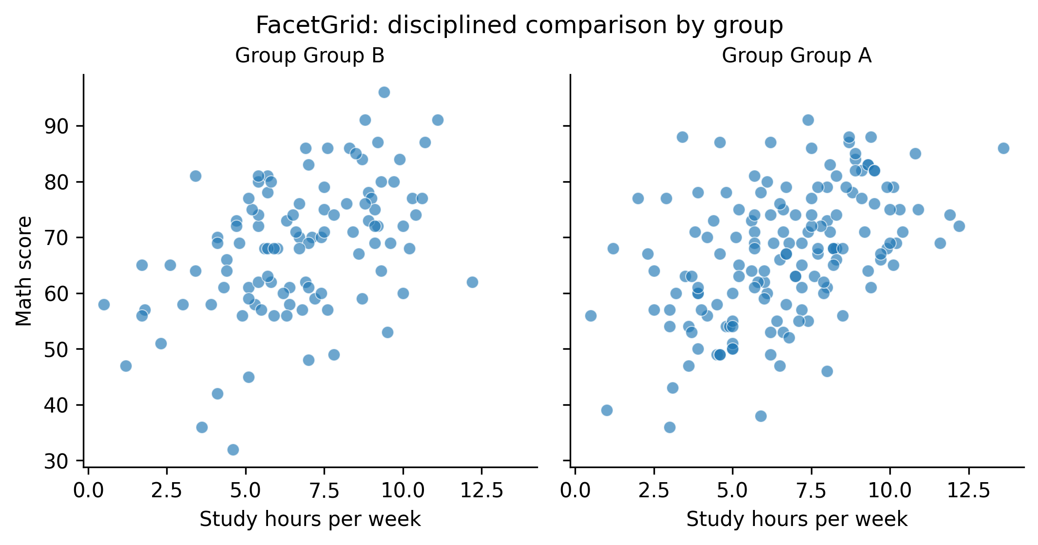
Seaborn: FacetGrid for quick small multiples
Seaborn can create small multiples quickly. It is useful for exploration when you want repeat the same plot across categories with minimal code.
g = sns.FacetGrid(df, col="group", height=3.6, aspect=1.0, sharey=True)g.map_dataframe(sns.scatterplot, x="study_hours", y="math_score", alpha=0.65)g.set_axis_labels("Study hours per week", "Math score")g.set_titles("Group {col_name}")g.fig.suptitle("FacetGrid: disciplined comparison by group", y=1.02)show_and_save_mpl(g.fig) # figures/07_003.png
Saved PNG → figures/07_003.png
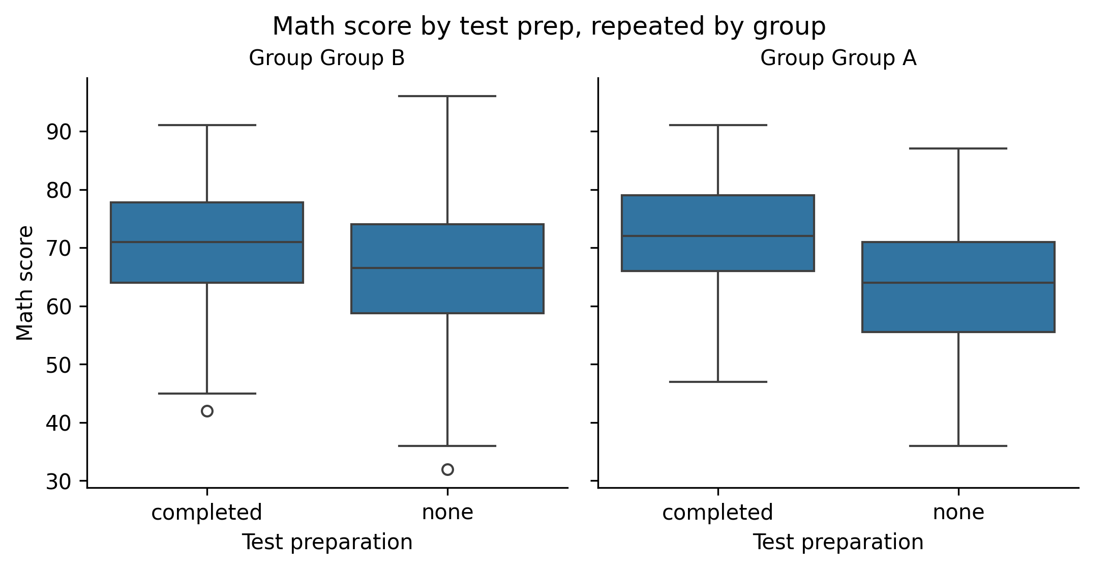
Seaborn: multi-panel categorical comparison
This uses a panel-per-group layout for a box plot.
g = sns.catplot( data=df, x="test_prep", y="math_score", col="group", kind="box", height=3.6, aspect=1.0, sharey=True,)g.set_axis_labels("Test preparation", "Math score")g.set_titles("Group {col_name}")g.fig.suptitle("Math score by test prep, repeated by group", y=1.02)show_and_save_mpl(g.fig) # figures/07_004.png
Saved PNG → figures/07_004.png
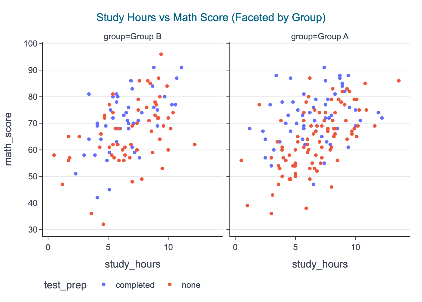
Plotly: facets for interactive multi-panel comparison
Plotly facets are great when you want the learner to: - hover points - zoom into a panel - toggle legend groups
In CDI publishing, we export a static PNG snapshot for consistency.
import plotly.express as pxfig = px.scatter( df, x="study_hours", y="math_score", color="test_prep", facet_col="group", title="Study Hours vs Math Score (Faceted by Group)",)# Center title by default; keep export stablecdi_theme(fig)show_and_save_plotly(fig, show=False) # figures/07_005.png
Saved PNG → figures/07_005.png
A simple layout checklist
When building multi-panel figures, check these every time:
Shared scales when comparing groups
Consistent labels across panels
Short panel titles (avoid full sentences)
One main title (figure-level), then small panel titles
Whitespace: use tight_layout() or controlled margins
Avoid legends inside panels if they block data
Key Takeaways
Multi-panel figures support disciplined comparison.
Matplotlib gives full control over layout and publication style.
Seaborn makes small multiples quick for exploration.
Plotly facets add interactivity during development and sharing.
Export all figures to PNG for stable Quarto book builds.
Exercises
Create a 2×2 Matplotlib grid showing: math, reading, writing distributions, plus one scatter plot.
Repeat a scatter plot by test_prep using Seaborn facets (row= or col=).
Build a Plotly faceted histogram of math_score by group and export the PNG.
In a small multiple figure, intentionally remove sharey=True and observe how it changes interpretation.