Common Visualization Mistakes and How to Avoid Them
ID: VISPY-FREE-11
Type: Lesson
Audience: Public
Theme: Diagnostic thinking in visualization
Professional visualization is not only about creating good figures.
It is about recognizing bad ones.
In this lesson, you will learn to identify and correct common mistakes:
misleading axes
inconsistent scaling
overloaded color
inappropriate chart types
distorted comparisons
Setup
import warningsimport pandas as pdimport matplotlib.pyplot as pltimport seaborn as snsfrom cdi_viz.theme import ( cdi_notebook_init, show_and_save_mpl,)warnings.filterwarnings("ignore")cdi_notebook_init(chapter="11")df = pd.read_csv("data/cdi-student-outcomes.csv")print("First rows:")print(df.head())
First rows:
     group  test_prep  study_hours  math_score  reading_score  writing_score
0  Group B  completed          3.9          58             64             51
1  Group A       none          7.7          67             85             61
2  Group A       none          9.3          83             65             73
3  Group A       none          3.9          60             67             48
4  Group A       none          8.3          68             63             47
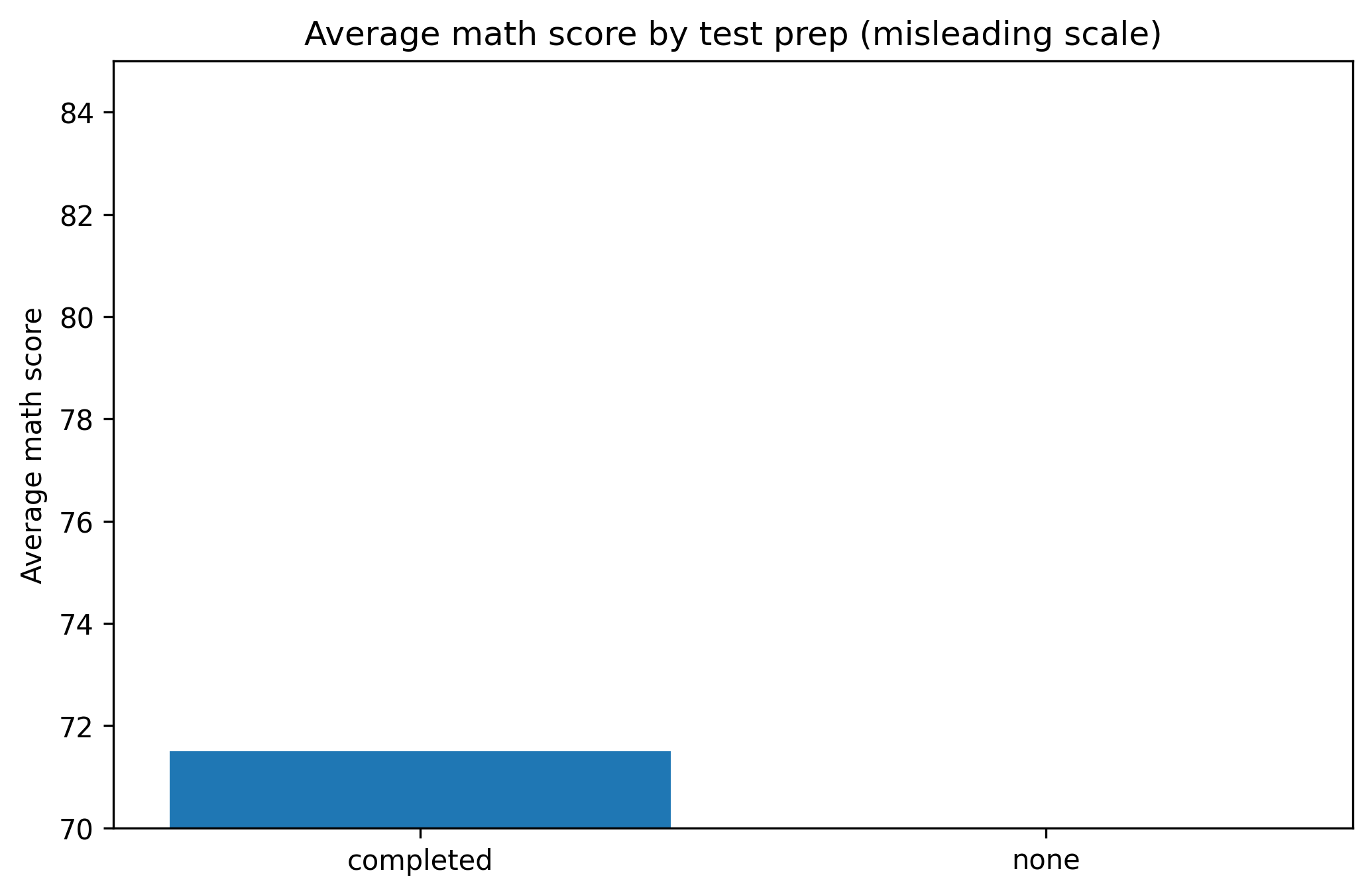
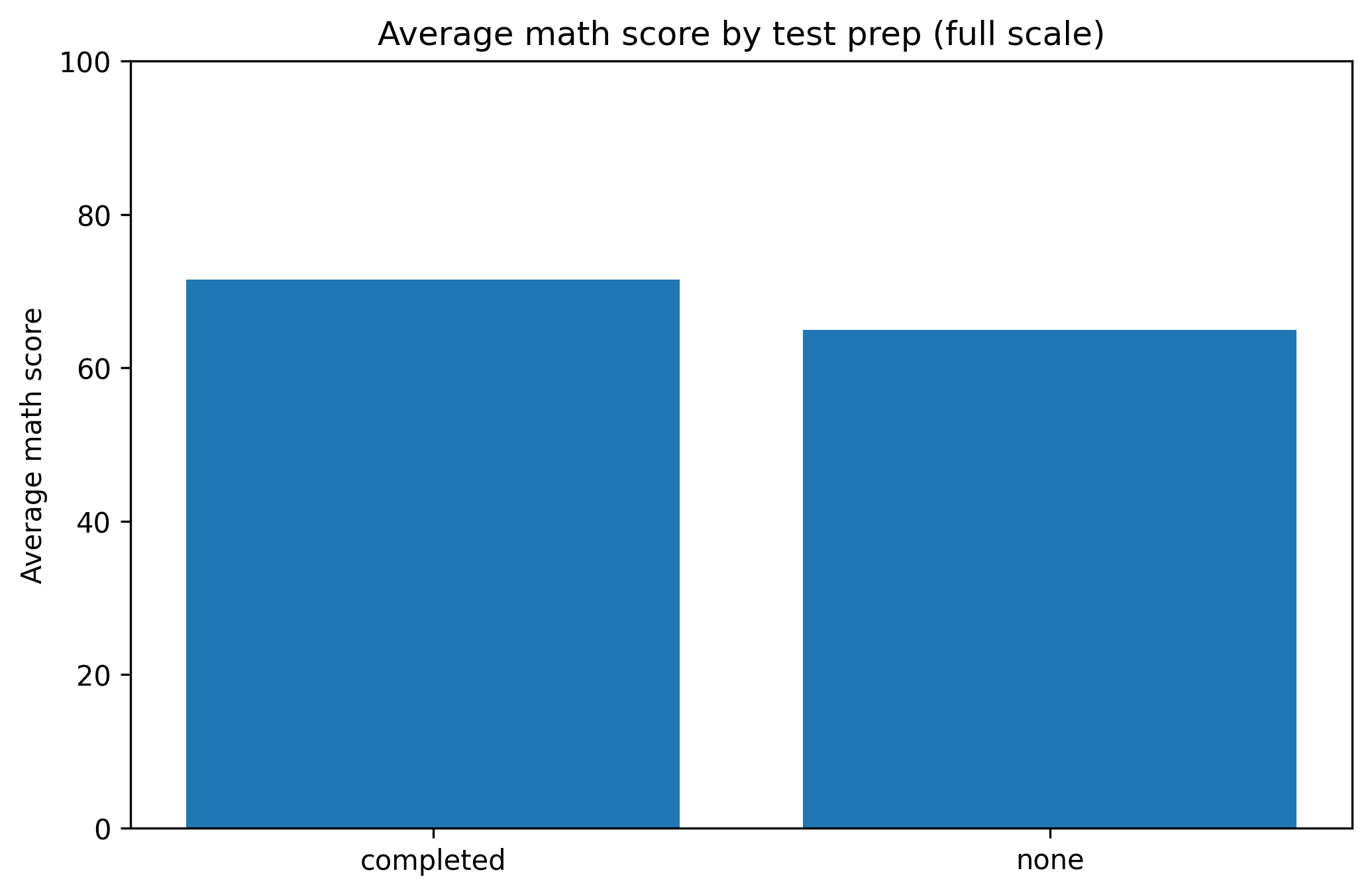
1. Truncated Axes
Truncating axes can exaggerate differences.
Misleading Version
group_means = df.groupby("test_prep")["math_score"].mean()fig, ax = plt.subplots(figsize=(7.0, 4.6))ax.bar(group_means.index, group_means.values)ax.set_ylim(70, 85) # truncated axisax.set_title("Average math score by test prep (misleading scale)")ax.set_ylabel("Average math score")fig.tight_layout()show_and_save_mpl(fig) # figures/11_001.png
Saved PNG → figures/11_001.png
Corrected Version
fig, ax = plt.subplots(figsize=(7.0, 4.6))ax.bar(group_means.index, group_means.values)ax.set_ylim(0, 100) # full logical rangeax.set_title("Average math score by test prep (full scale)")ax.set_ylabel("Average math score")fig.tight_layout()show_and_save_mpl(fig) # figures/11_002.png
Saved PNG → figures/11_002.png
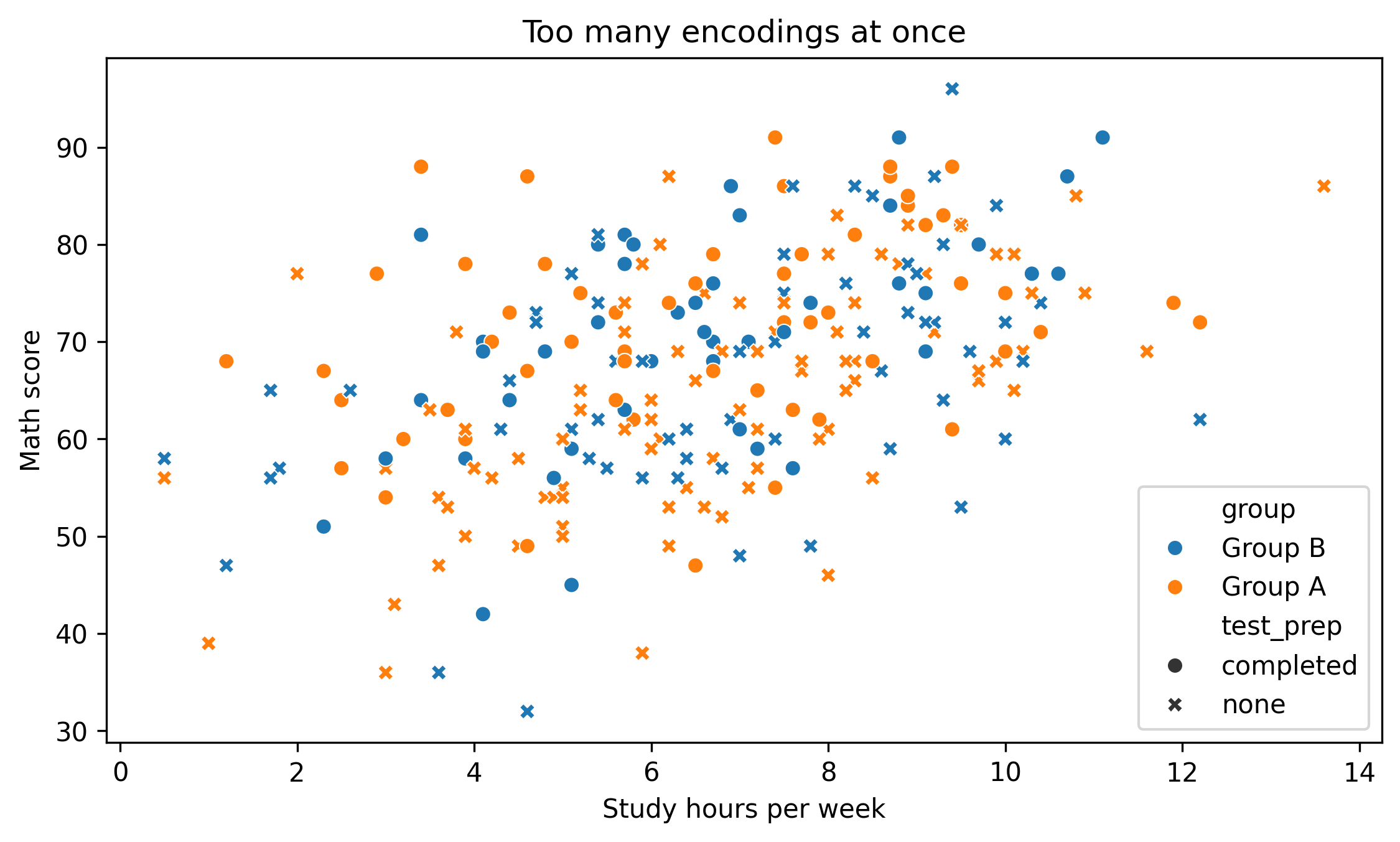
2. Overloaded Color
Too many colors reduce clarity.
fig, ax = plt.subplots(figsize=(7.6, 4.6))sns.scatterplot( data=df, x="study_hours", y="math_score", hue="group", # multiple categories style="test_prep", ax=ax)ax.set_title("Too many encodings at once")ax.set_xlabel("Study hours per week")ax.set_ylabel("Math score")fig.tight_layout()show_and_save_mpl(fig) # figures/11_003.png
Saved PNG → figures/11_003.png
Ask yourself:
Is every encoding necessary?
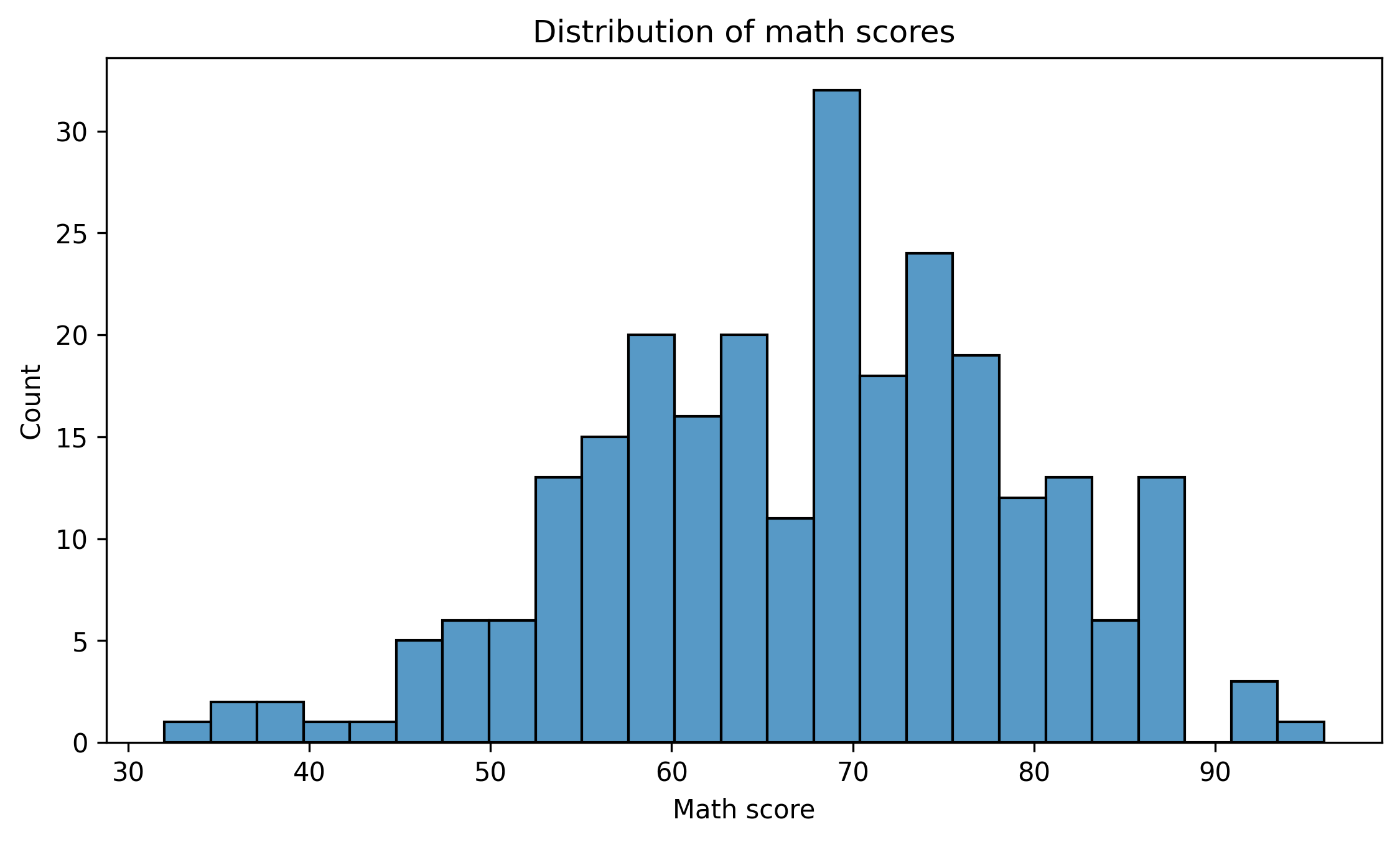
3. Wrong Chart Type
Bar charts are often misused for continuous distributions.
Better:
fig, ax = plt.subplots(figsize=(7.6, 4.6))sns.histplot(df["math_score"], bins=25, ax=ax)ax.set_title("Distribution of math scores")ax.set_xlabel("Math score")ax.set_ylabel("Count")fig.tight_layout()show_and_save_mpl(fig) # figures/11_004.png
Saved PNG → figures/11_004.png
Choose the chart type that matches the data structure.
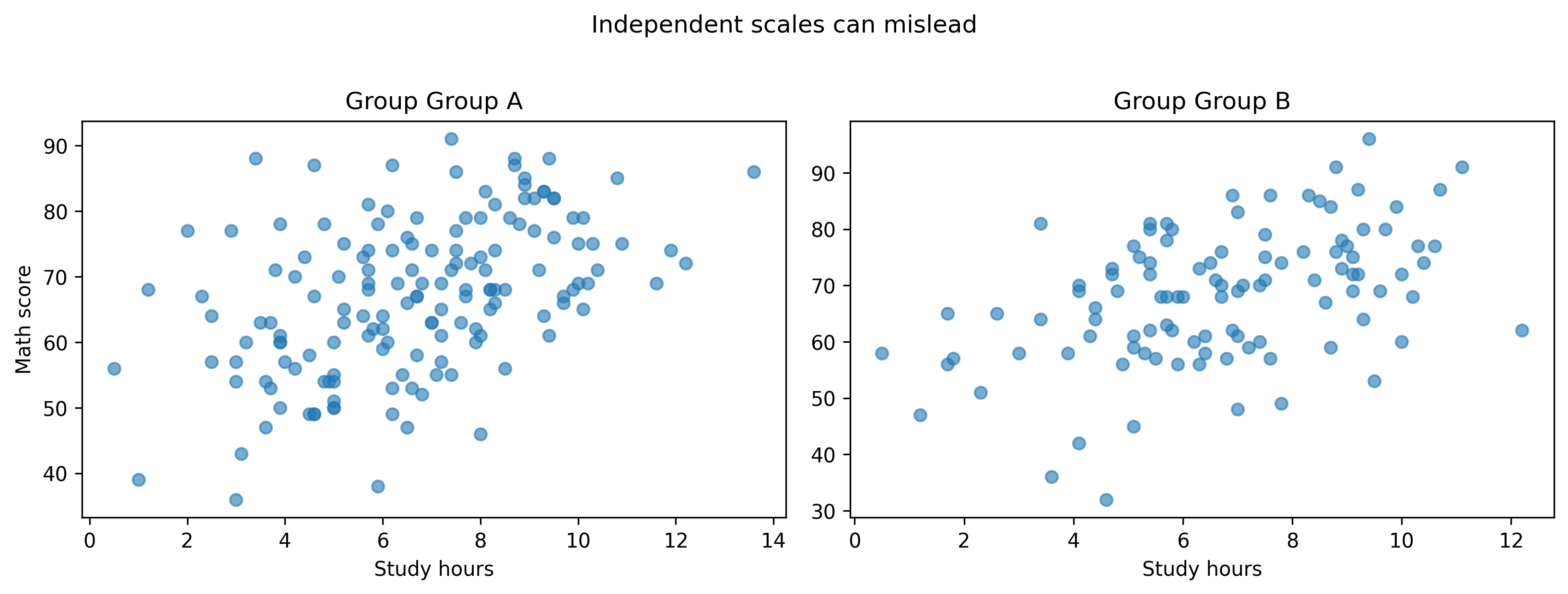
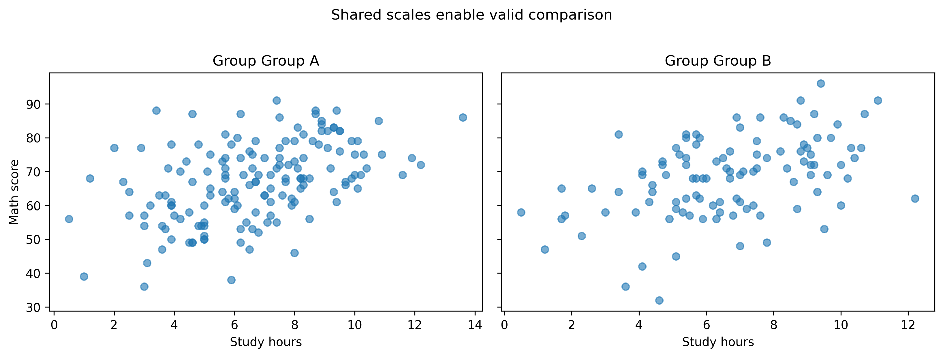
4. Independent Scales in Multi-Panel Figures
Without shared scales, comparisons break.
groups =sorted(df["group"].unique())fig, axes = plt.subplots(ncols=len(groups), figsize=(11, 4))for ax, g inzip(axes, groups): sub = df[df["group"] == g] ax.scatter(sub["study_hours"], sub["math_score"], alpha=0.6) ax.set_title(f"Group {g}") ax.set_xlabel("Study hours")axes[0].set_ylabel("Math score")fig.suptitle("Independent scales can mislead", y=1.02)fig.tight_layout()show_and_save_mpl(fig) # figures/11_005.png