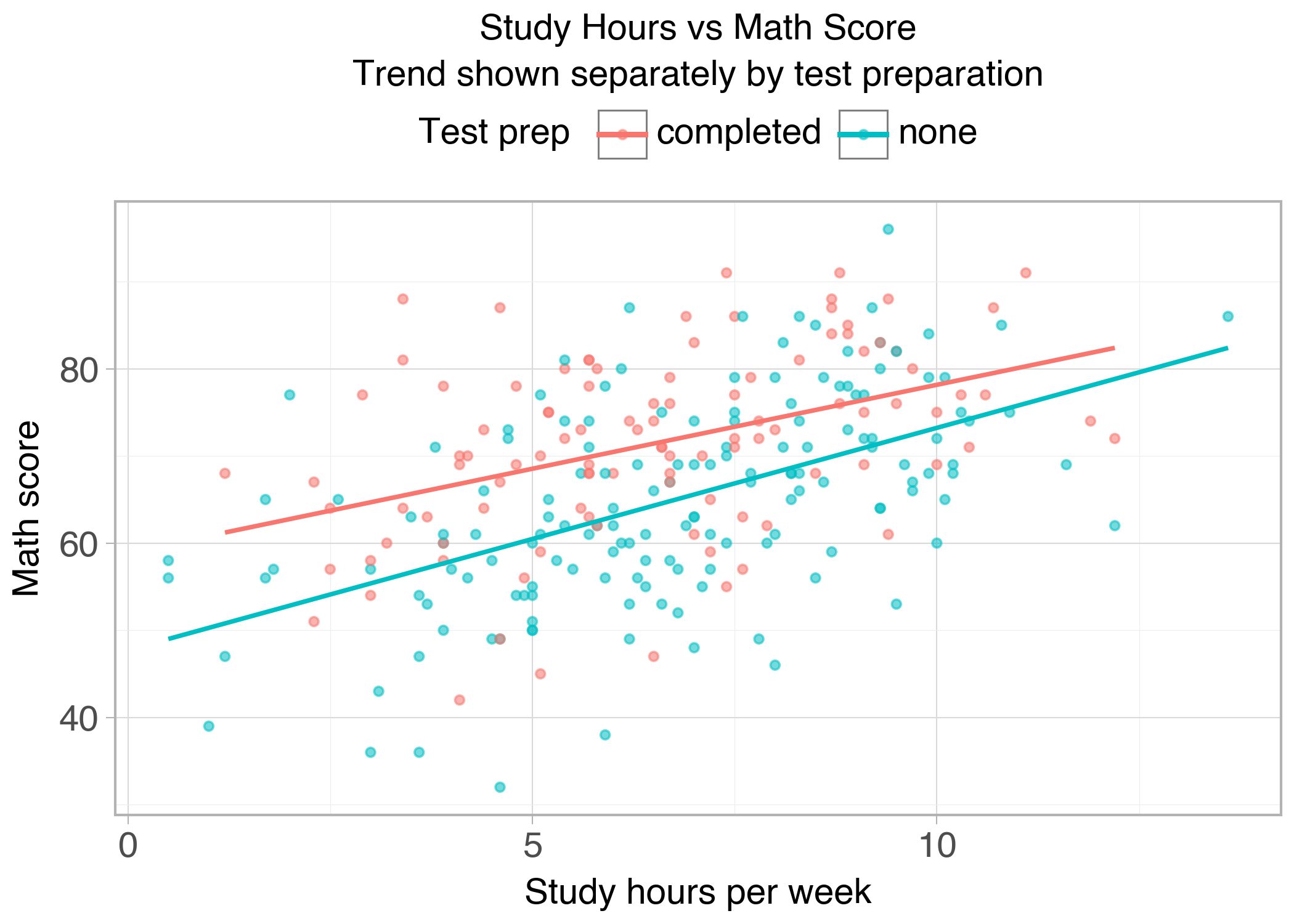
p = ( ggplot(df, aes(x="study_hours", y="math_score", color="test_prep"))+ geom_point(alpha=0.55)+ geom_smooth(method="lm", se=False)+ labs( title="Study Hours vs Math Score", subtitle="Trend shown separately by test preparation", x="Study hours per week", y="Math score", color="Test prep" )+ theme_light(base_size=14))show_and_save_plotnine(p)
Saved PNG → figures/05_001.png
What matters here is the separation:
aes(...) describes meaning (what encodes what)
geom_* layers add marks and models
labels and theme tune readability without changing meaning
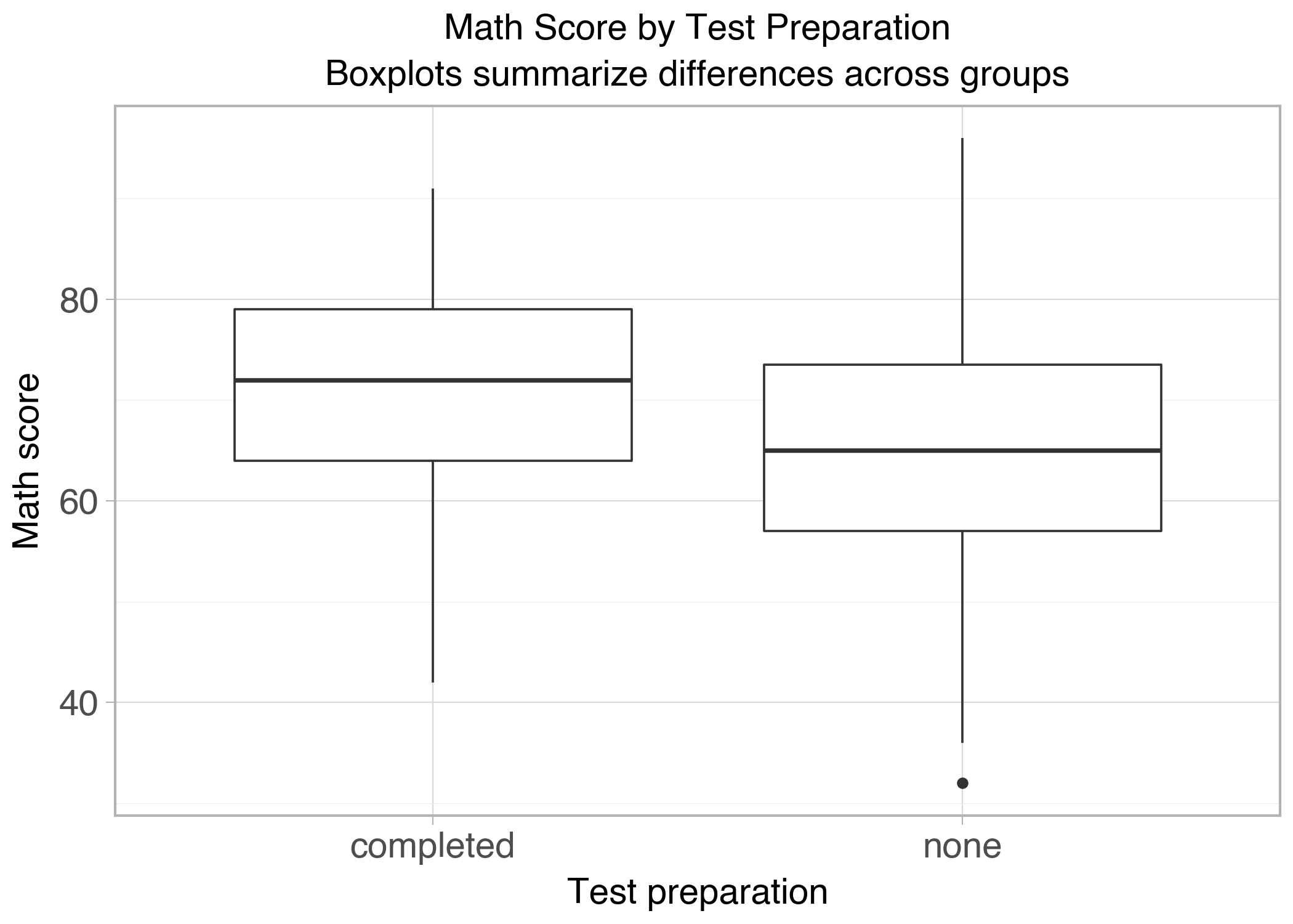
Group comparison (summary)
p = ( ggplot(df, aes(x="test_prep", y="math_score"))+ geom_boxplot()+ labs( title="Math Score by Test Preparation", subtitle="Boxplots summarize differences across groups", x="Test preparation", y="Math score" )+ theme_light(base_size=14))show_and_save_plotnine(p)
Saved PNG → figures/05_002.png
Boxplots summarize:
central tendency (median)
spread (IQR)
potential outliers
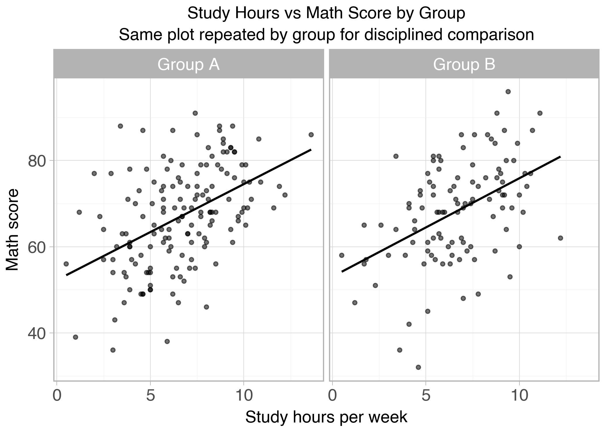
Faceting: small multiples
Faceting repeats the same plot by group. This forces disciplined comparison because every panel uses the same encodings.
p = ( ggplot(df, aes(x="study_hours", y="math_score"))+ geom_point(alpha=0.55)+ geom_smooth(method="lm", se=False)+ facet_wrap("~group")+ labs( title="Study Hours vs Math Score by Group", subtitle="Same plot repeated by group for disciplined comparison", x="Study hours per week", y="Math score" )+ theme_light(base_size=14))show_and_save_plotnine(p)
Saved PNG → figures/05_003.png
Key Takeaways
Grammar-of-graphics is a mental model, not a brand.
Separate mappings (meaning) from styling (appearance).
Layering helps you modify plots without restarting.
Faceting is one of the cleanest ways to compare groups.